Spreadsheet
The spreadsheet in GeoGebra has most of the regular spreadsheet-features. When it comes to just doing numerical calculations, regular spreadsheet software is more advanced than the GeoGebra spreadsheet. The object-oriented way of doing things in GeoGebra however, makes the spreadsheet a very useful tool. Apart from manipulating numbers and formulas, you can also manipulate all GeoGebra-objects in the spreadsheet view.
Whenever you need many objects that follow some regular pattern, you can use the spreadsheet.
Relative copies
A spreadsheet is a table of so-called cells. Each cell is denoted by a letter (the column) and a number (the row).
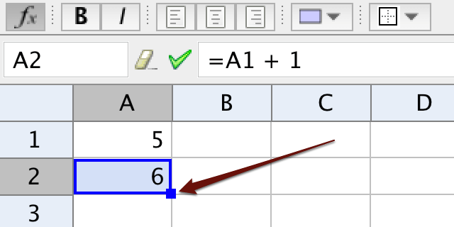
The basic feature of any spreadsheet is that you can make relative copies by dragging a cell, or by dragging many cells. After selecing one or many cells, a filled-in blue rectangle is shown in the lower right corner of the selection. By dragging the filled in rectangle, you make so called relative copies.
If cell A1 contains the value 5 and A1 + 1 is written in cell A2, then the value of A1 is picked from the relative position, i.e. from the cell above. When A2 is dragged downwards to make relative copies, each cell vill get the value from the cell above and add one to this value.
Absolute references
You can use the dollar-sign to make copies using an absolute reference.
By writing $A1, you make an absolute reference to A1 when dragging along a row.
By writing A$1, you make an absolute reference to A1 when dragging along a column.
By writing $A$1, you make an absolute reference to A1 when dragging both along a column and along a row.
Absolute references can be used for producing a multiplication table.
Creating objects using the spreadsheet
You can create objects by writing commands in a cell in the spreadsheet. If you need help writing a command, write it in the input bar of the spreadsheet to get help with code completion.
Dynamic colors
If you right-click on an object to see the properties-window, there is a heading Dynamic Colors under the tab Advanced. Here you can specify a color by giving the red, green, and blue value. Each value must be between 0 and 1. You can write logical expressions for what colors to use, or let the color depend on some variable, hence the name dynamic colors. In the spreadsheet you can let the color of an object depend on the value of some cell. When making relative copies, the values of the colors will also be relatively copied.
Creating functions using the spreadsheet
If you write an expression using the variable \(x\), GeoGebra will create a function of \(x\). By writing such expressions in cells in the spreadsheet, you can create functions.
Exercise
Exercise 1
Linear and exponential pay raise
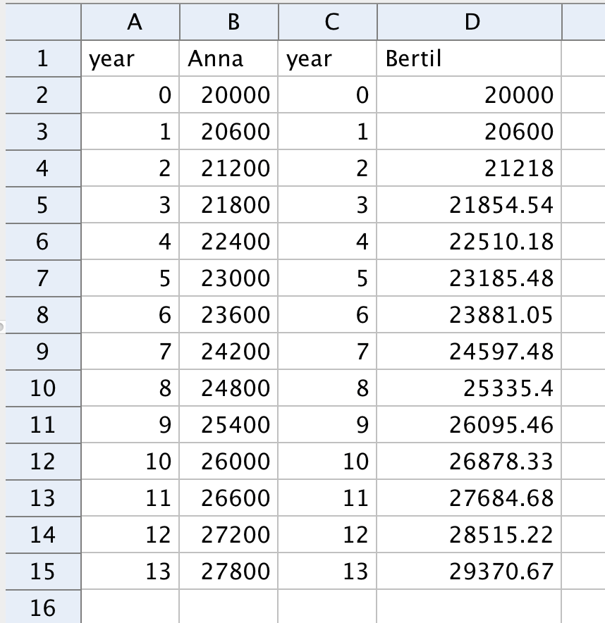
Make a slider \(a\) of integer values between 0 and 10,000 representing Anna's annual raise of her monthly salary in Swedish kronor.
Make a slider \(b\) of integer values between 0 and 100 representing Bertil's annual percentage raise of his monthly salary.
-
Enter year and monthly salaries for Anna and Bertil in the spreadsheet and make relative copies showing their salaries over a number of years. Let them start with the same salary year 0.
-
Create a list of points for Anna and one for Bertil. Select cells from two columns, then choose
Create - > List of points.Drag the \(y\)-axis until you see the points in the graphics view.
- Drag the sliders to study the salaries.
Exercise 2
Parabola
The ancient Greeks didn't have the Cartesian coordinate system or functions. For them a parabola was a geometric object that could be defined like this:
Given a line (called the directrix) and a point (called focus) a parabola is the set of points having the same distance to the point and to the line.
A point \(P\) having the same distance to the point and to the line must lie on the perpendicular bisector of the point and some point on the line. It can be shown that this perpendicular bisector is a tangent to the parabola through \(P\). Many perpendicular bisectors can be used to show the shape of the parabola.
Part 1
Make a point \(A\) and a line through two points \(B\) and \(C\). Place a fourth point \(D\) on the line and create the perpendicular bisector between \(A\) and \(D\).
Put a trace on the perpendicular bisector and drag \(D\).
Part 2
Instead of the using trace you will now create a number of points on the line and a number of perpendicular bisectors.
- Remove the trace from the perpendicular bisector.
- Place a point \(E\) on the line and make a vector \(\vec{u}\) from \(D\) to \(E\).
- Rename \(D\) to \(A1\) and \(E\) to \(A2\). In that way they will be shown in the spreadsheet.
- Write
A2 + uin cell A3 and make relative copies along column A. - Write
PerpendicularBisector(A1, A)in cell B1 and make relative copies along column B. - Change the focus and the directrix, all perpendicular bisectors should also change dynamically.
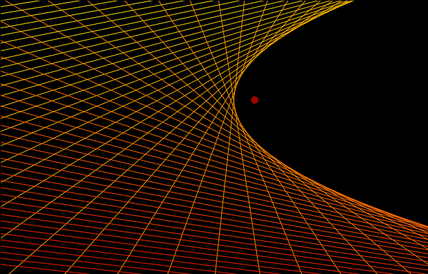
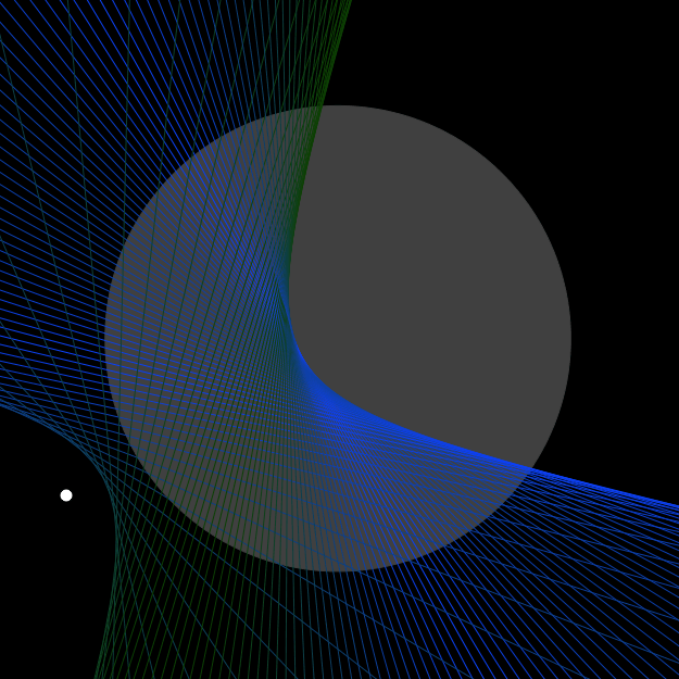
Comment: In a similar way you can make perpendicular bisectors between a point and points on a circle. Such an example is shown at the top of this page.
Exercise 3
Discrete model of dog chasing rabbit
A rabbit is running along a river. In the model the rabbit starts at the origin and runs upwards along the \(y\)-axis.
A dog sees the rabbit and starts chasing it. In the model the dog starts somewhere on the positive \(x\)-axis.
The dog runs a short distance along a straight line. Then it looks up, sees the rabbit and changes its direction. Then it runs another short distance along a straight line. And so on.
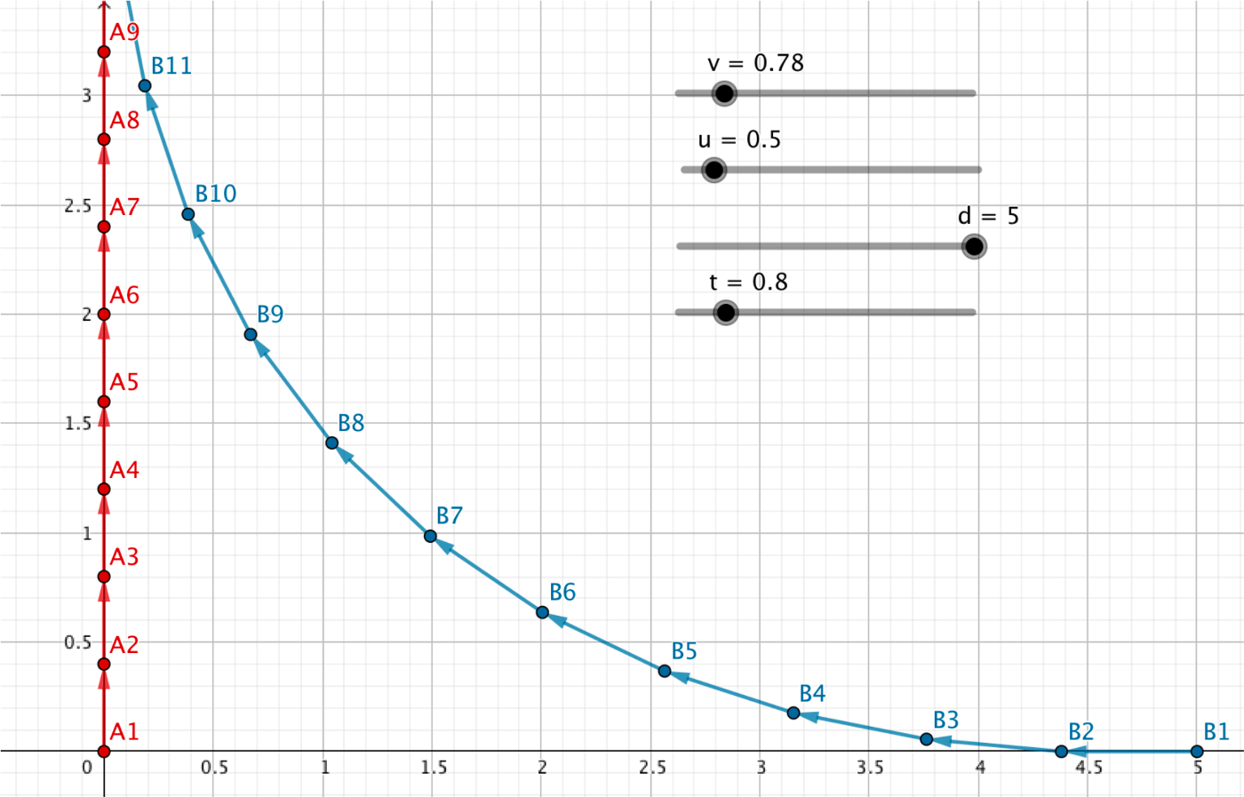
Make four sliders.
- Two sliders \(u\) and \(v\) representing the speeds of the rabbit and the dog.
- A slider \(d\) representing the initial distance between the dog and the rabbit.
- A slider \(t\) representing the time step during which the dog runs along a straight line.
Create all other objects needed for the model.
You may need the command UnitVector( <Vector> ) and the command Vector( <Point>, <Point> ).
If your model assumes that the dog never runs into the river, i.e. never crosses the \(y\)-axis, you can make an if-statement to achieve this. You make an if-statement using the command If( <Condition>, <Then>, <Else> ). It is up to you whether you let the dog run into the river or not.
When you are done you should be able to drag the sliders to see different trajectories.
further info:
Fourier Series - Square Wave from Wolfram MathWorld
Envelope: http://en.wikipedia.org/wiki/Envelope_(mathematics)
by Malin Christersson under a Creative Commons Attribution-Noncommercial-Share Alike 2.5 Sweden License